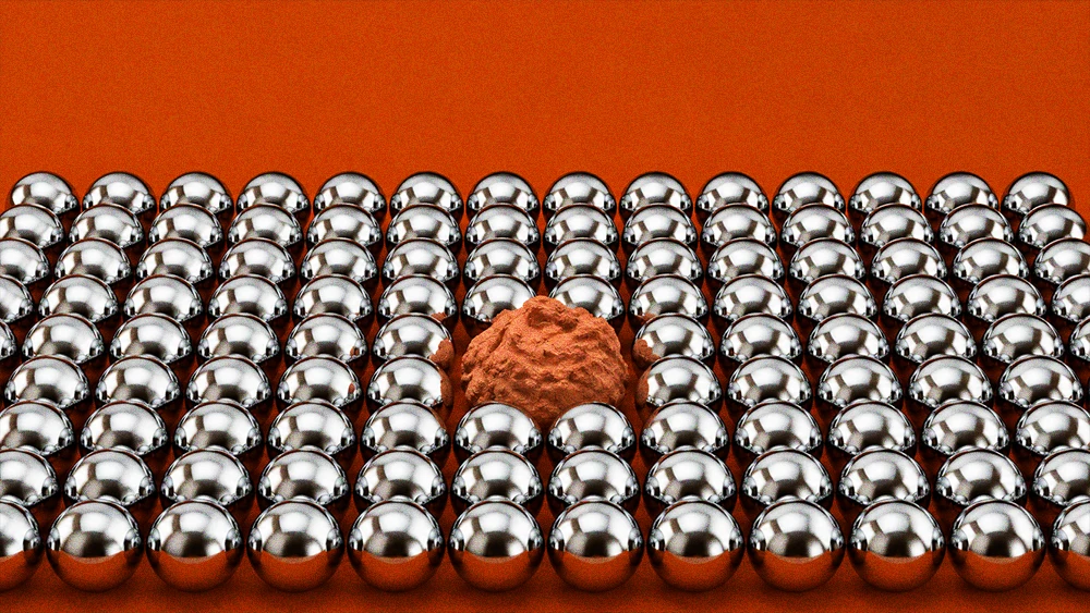
For most of the history of this industry, a typo in brand copy was a firing offense. Proofreaders existed to catch them. Agencies built entire QA layers around the assumption that a single misplaced apostrophe on a billboard could become a news story, and not the good kind. The error was the enemy.
That assumption is quietly collapsing, and it is collapsing because of what surrounds the error now. When every brand can generate unlimited grammatically flawless copy in seconds, flawlessness stops meaning care. It starts meaning automation. And audiences, who have become remarkably good at sensing machine-made language even when they cannot articulate why, have begun doing something strange: they are reading brand copy the way a customs officer reads a passport. Not for the message. For the tells.
The twist is which tells they are looking for. They are not scanning for signs of quality. They are scanning for signs of a person. And nothing signals a person quite like a mistake.
The typo changed sides
In May, The Atlantic put a name on this in a piece called "The Typo Vibe Shift." The reporting found job applicants deliberately seeding small errors into cover letters to prove a human wrote them, and executives sending out imperfect emails and getting praised for authenticity rather than dragged for sloppiness. On dating apps, where profiles are now routinely machine-composed, the typo has gone from red flag to green one.
The most telling voice in that story belongs to Nicole Ellison, a professor at the University of Michigan School of Information. In 2006, Ellison published research showing that spelling mistakes in dating profiles actively turned people off. Two decades later she has watched her own finding invert. "A typo maybe signals that you actually do care," she told Time, because it suggests someone sat down and typed the thing themselves.
Think about what a reversal that is. The same surface-level flaw, in the span of one professional lifetime, has flipped from evidence of low effort to evidence of effort. The flaw did not change. The baseline did. When perfect text was expensive, perfection signaled investment. Now that perfect text is free, imperfection does.
The research keeps stacking up on the same side. A 2024 study found that people responded more warmly to customer service chatbots that made and then corrected small errors. The mistake functioned as a humanizing event, a moment where the machine briefly behaved like one of us. Peter Cardon's research at USC Marshall, also cited in the Atlantic piece, found that people are measurably less likely to act on or engage with emails they believe were generated by AI. The audience is not neutral on authorship. They are voting, and they are voting with attention.
The numbers behind the instinct
If this still sounds like a media narrative rather than a market reality, the consumer data is blunt. A Klaviyo and Datalily survey of 8,000 consumers across eight countries, fielded in December 2025, found that only 7 percent of people trust a brand more when its marketing is visibly AI-generated. Thirty-one percent trust it less. That is not a rounding error. That is a four-to-one penalty for looking synthetic.
Gartner's research points the same direction: roughly half of US consumers say they would prefer to buy from brands that avoid generative AI in customer-facing content altogether. And experiments run by researchers at the Nuremberg Institute for Market Decisions found that simply labeling content as AI-made caused people to trust it less and engage with it less, even when the content itself was identical. The audience is not evaluating the words. They are evaluating the author.
Here is the uncomfortable implication for anyone who writes brand language for a living. Your copy is no longer being judged only on clarity, persuasion, and voice. It is being judged on provenance. And in the absence of a byline, readers infer provenance from texture. Perfect texture reads as machine. Rough texture reads as human. The error, or at least the possibility of one, has become a watermark.
We have been here before, sort of
None of this should shock anyone who remembers their consumer psychology. Elliot Aronson demonstrated in 1966 that competent people become more likable after a small blunder. The pratfall effect has been a branding staple for decades, from Avis admitting it was number two to Domino's confessing its pizza was bad and riding that confession to a double-digit sales bump. Adam Ferrier's famous cookie test found that two thirds of people preferred the cookie with the rough, broken edge over the identical one with the smooth edge. Imperfection has always carried a strange premium.
What is new is the mechanism. The pratfall effect worked because flaws made competent brands relatable. The current shift works because flaws make brands verifiable. Relatability is a warmth play. Verification is a trust play, and trust is the scarcer commodity right now. Audiences are not charmed by your typo. They are reassured by it. It functions less like a joke and more like a signature.
The design world caught this before most copywriters did. Canva's 2026 trends report, built on data from more than 260 million users, was literally titled "Imperfect by Design." Adobe's data shows nearly three quarters of designers now deliberately add imperfect elements to distinguish their work from AI output. Affinity rebranded around a lowercase, hand-drawn mark. Eventbrite launched a deliberately bouncy, uncorporate logo. Wonky serifs and visible brushstrokes are everywhere for the same reason the typo is being rehabilitated: they are proof of hand.
Before you start planting mistakes
The tempting takeaway is the wrong one. No, you should not start salting your email campaigns with fake typos. For three reasons.
First, the pratfall effect has a precondition everyone forgets: it only works for brands already perceived as competent. Aronson's own research showed that when a low performer stumbles, the stumble just confirms the low opinion. If your brand has not earned credibility, errors will read as errors.
Second, manufactured imperfection is a fad with a short shelf life. Designer Elizabeth Goodspeed made the point sharply in the context of the anti-AI aesthetic: faking realness on a computer gets us nowhere new. The moment audiences learn that brands are engineering their typos, the typo stops being a signal and becomes just another technique, and a slightly cynical one. Counterfeit humanity is still counterfeit.
Third, and most practically, the typo was never the point. The typo is a proxy. What audiences are actually hungry for is evidence that a person with a stake in the message sat with it, made choices, and sent it. Errors happen to correlate with that. They are not the cause of it.
What to do instead
The real brief for brand language in 2026 is not "make mistakes." It is "write in a way no machine would." That means specificity that only comes from being in the room. Opinions that carry risk. References that are slightly too niche. Sentences whose rhythm varies because a person got bored writing the same shape twice. A willingness to say we got this wrong, unprompted, when you did. Let your founders and your team write some things themselves, lightly edited, fingerprints intact.
And when a genuine error slips through, resist the old panic. Correct it in public, with some personality, and move on. Your audience has already recalibrated. They know the difference between a brand that is careless and a brand that is human, and they have never been more motivated to find out which one you are.
The proofreaders are still employed. It is just that now, half of them work for the audience.