


powered by


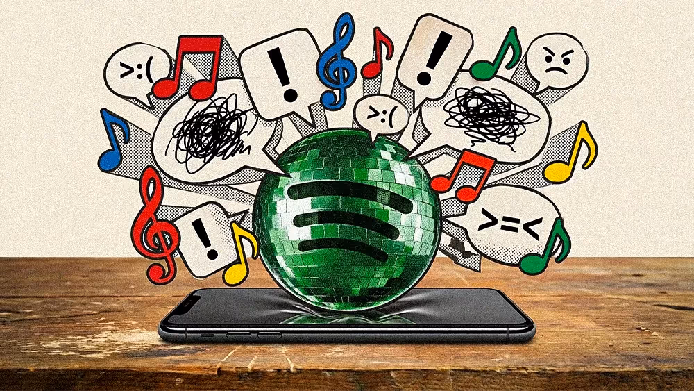
Spotify replaced its flat green icon with a glittering disco ball for five days. The backlash was instant. The virality was bigger. And the brand strategy underneath it is the one your team should be studying right now.

There is a version of this story that reads like a design controversy. Beloved tech company changes its icon. Users revolt. Company walks it back. Everyone moves on.
That version misses everything worth paying attention to. What Spotify pulled off last week is the sharpest brand activation of the year so far, and the fact that most people are still debating whether the logo was ugly is proof that it worked.
On May 13, Spotify swapped its app icon to mark its 20th anniversary. The flat green circle that has carried three curved soundwave lines since 2006 was replaced by a green disco ball, textured, reflective, full of gradients and depth. The kind of thing that looks like it was designed in 2004, on purpose, by someone who knows exactly what they are doing.
The soundwave lines stayed. The green stayed. Everything that makes the icon recognizable at a glance was preserved. But the surface changed completely, trading the minimalist flatness that has defined tech iconography for a decade for a glossy, light-catching disco ball that wanted to be noticed.
It started appearing on iOS home screens without warning, with no advance press cycle and no leaked renders on a design blog. One day you picked up your phone and Spotify looked like it was ready to go out.
Within hours, the internet fractured exactly the way Spotify needed it to.
One camp hated it. Users called it ugly. Some moved the app off their home screen entirely. The word "dated" showed up in nearly every thread, along with the kind of real indignation that only surfaces when someone changes something people interact with 30 times a day without thinking about it.
Another camp loved it for the exact reasons the first camp hated it. The disco ball was garish, and that was the appeal. Every app icon on your home screen graduated from the same design program, and a sparkling green disco ball had actual personality.
A third camp landed on conditional acceptance once they found out the change was temporary. Spotify confirmed it on May 17, writing on X: "Alright, we know glitter is not for everyone. Our temp glow up ends soon. Your regularly scheduled Spotify icon returns next week."
Then there was the fourth reaction, the one that matters most for anyone reading this. Disappointment that it was going away. Users started asking Spotify to make the disco ball an opt-in choice. Others argued that every tech company should be doing this, that flat design has overstayed its welcome, that apps should be allowed to have personality again. One user wrote that Spotify had just paved the way for apps to have personality again, and that the same people who complained are the ones who romanticize the skeuomorphic design era they grew up with.
None of that is a backlash. It is a cultural conversation Spotify now owns.
The disco ball was not a standalone stunt. It was the front door of a larger 20th anniversary campaign called "Your Party of the Year(s)," which rolled out personalized experiences showing users their first-ever streamed song, their all-time listening stats, and nostalgic data drops over 20 days.
The campaign turned Spotify's own history into content, and the disco ball was the visual signature that tied it together. Every time someone tweeted about the ugly logo, posted a screenshot, Googled "why is Spotify a disco ball," or moved the app to their back screen and told people about it, they were driving awareness for the anniversary activation underneath. Search volume for that phrase exploded within hours of the rollout.
Spotify did not need people to like the logo. They needed people to notice it, and those are very different objectives. The second one is significantly harder to achieve with a product that 600 million people already use without thinking about it.
The design discourse is a red herring. Whether the disco ball was aesthetically successful is the least interesting question you can ask about what happened last week.
The interesting question is what it tells you about where brand confidence is headed.
For years, the unspoken agreement in consumer tech has been that icons should be clean, flat, and invisible. An app icon is not supposed to make a statement. It is supposed to disappear into the grid, load fast, and get out of the way. The entire visual language of the post-iOS 7 era was built around the idea that less is more, that professionalism means restraint, that the best design is the design you do not notice.
Spotify broke that agreement on purpose, not permanently, not recklessly, but with enough force to make everyone on the internet have an opinion about an app icon for the first time in years.
The temporary framing is what made it smart. A permanent rebrand to a disco ball would have been a risk with unclear upside. A five-day anniversary takeover that generates global conversation, drives search traffic, and reintroduces 20 years of brand nostalgia through a single visual device is something else entirely: a controlled detonation.
First, temporary brand gestures are wildly underutilized. Most companies treat their visual identity like a legal contract, rigid, unchanging, protected by brand guidelines that were written to prevent exactly this kind of move. Spotify showed that a time-boxed deviation from your own brand system can generate more attention and emotional investment than years of consistency ever will, specifically because it breaks the pattern. Your brand guidelines should have a chapter for controlled rule-breaking, and they almost certainly do not.
Second, you do not need everyone to like it, because the discourse is the distribution. Every person who complained about the disco ball told at least one other person about it, and the negative reaction was not a failure of the campaign but a structural feature of it. If you are still measuring brand activations by sentiment alone, you are reading the wrong scorecard.
Third, brand is not just what you look like. It is what you are willing to do. The disco ball communicated something about Spotify that no press release or earnings call could: that after 20 years and 600 million users, the company still has the confidence to do something weird and a little rough around the edges for no reason other than to celebrate the fact that it still exists. Most tech brands right now are optimizing every visible surface for conversion, and that kind of playfulness is rarer than it should be. The brands that still have it are the ones people feel something about.
The disco ball is going back in the drawer this week. The flat green circle returns, and everything goes back to normal.
But Spotify just proved something that most brand teams are still afraid to test: the safest thing you can do with a recognizable brand is occasionally let it be unrecognizable. Not forever, and not without guardrails, but long enough to remind people that underneath the system, there is still a company that knows how to throw a party.


The best editorial systems don’t happen by accident. Outlever builds them.


The best editorial systems don’t happen by accident. Outlever builds them.

Subscribe for the kind of thinking that makes people stop, read and come back.